> ## Documentation Index
> Fetch the complete documentation index at: https://docs.papermap.ai/llms.txt
> Use this file to discover all available pages before exploring further.
# React Components
Papermap also supports embedding with React components through `@papermap/papermap`. This package lets you embed Papermap-native chat, chart cards, and board layouts directly in your application instead of embedding the full dashboard iframe.
## Main Components
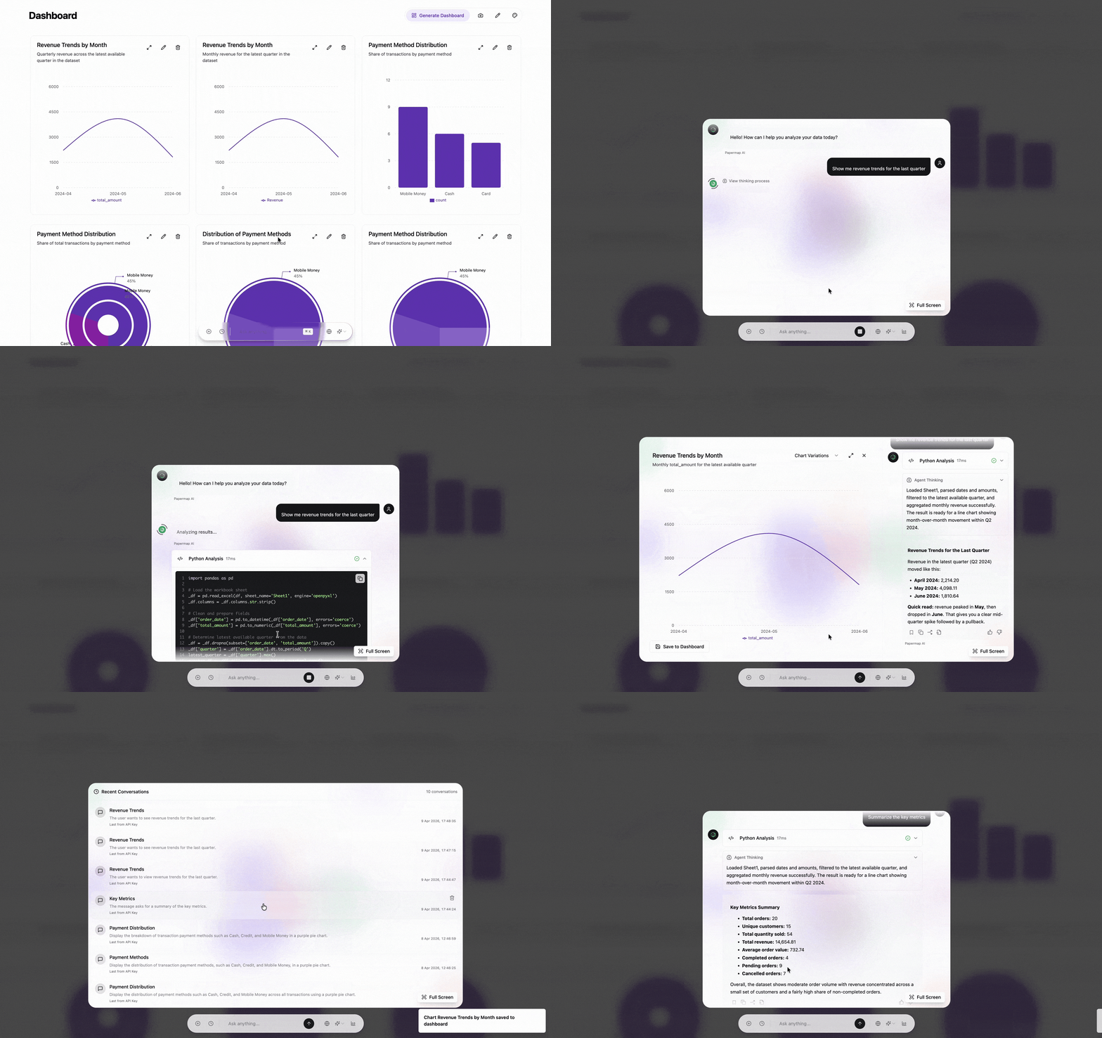
* **`PaperChat`**: Full AI chat assistant with streaming, conversation history, and chart generation.
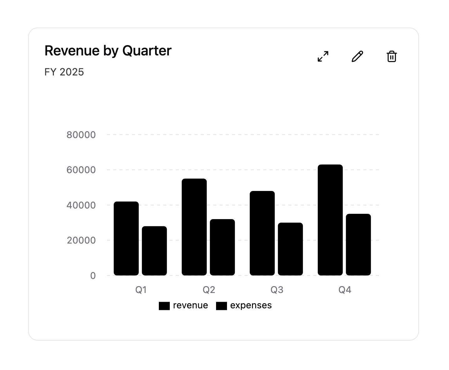
* **`PaperCard`**: Standalone chart card with toolbar actions. Use `variant="streaming"` for an embedded chart and conversation dialog without the floating assistant.
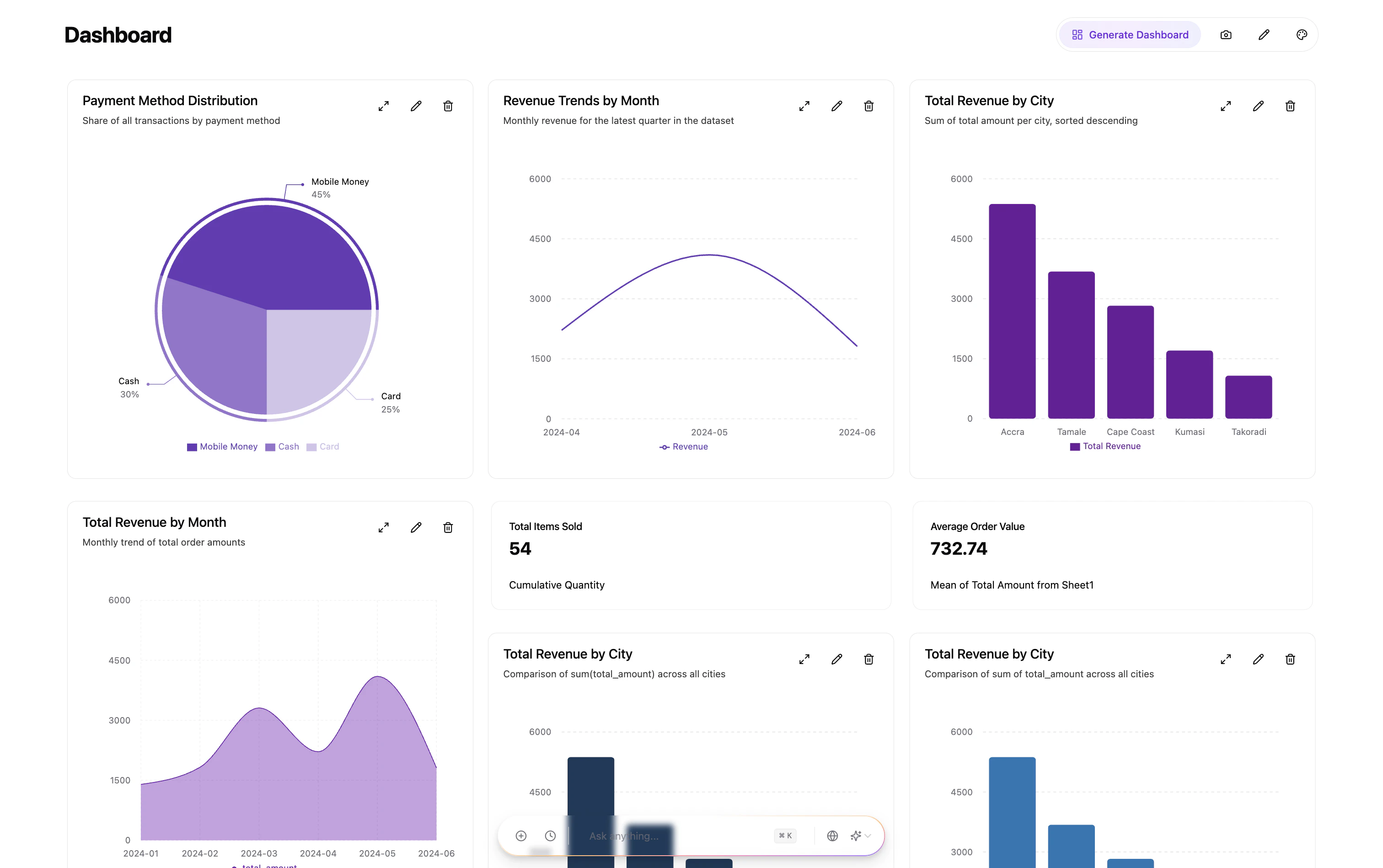
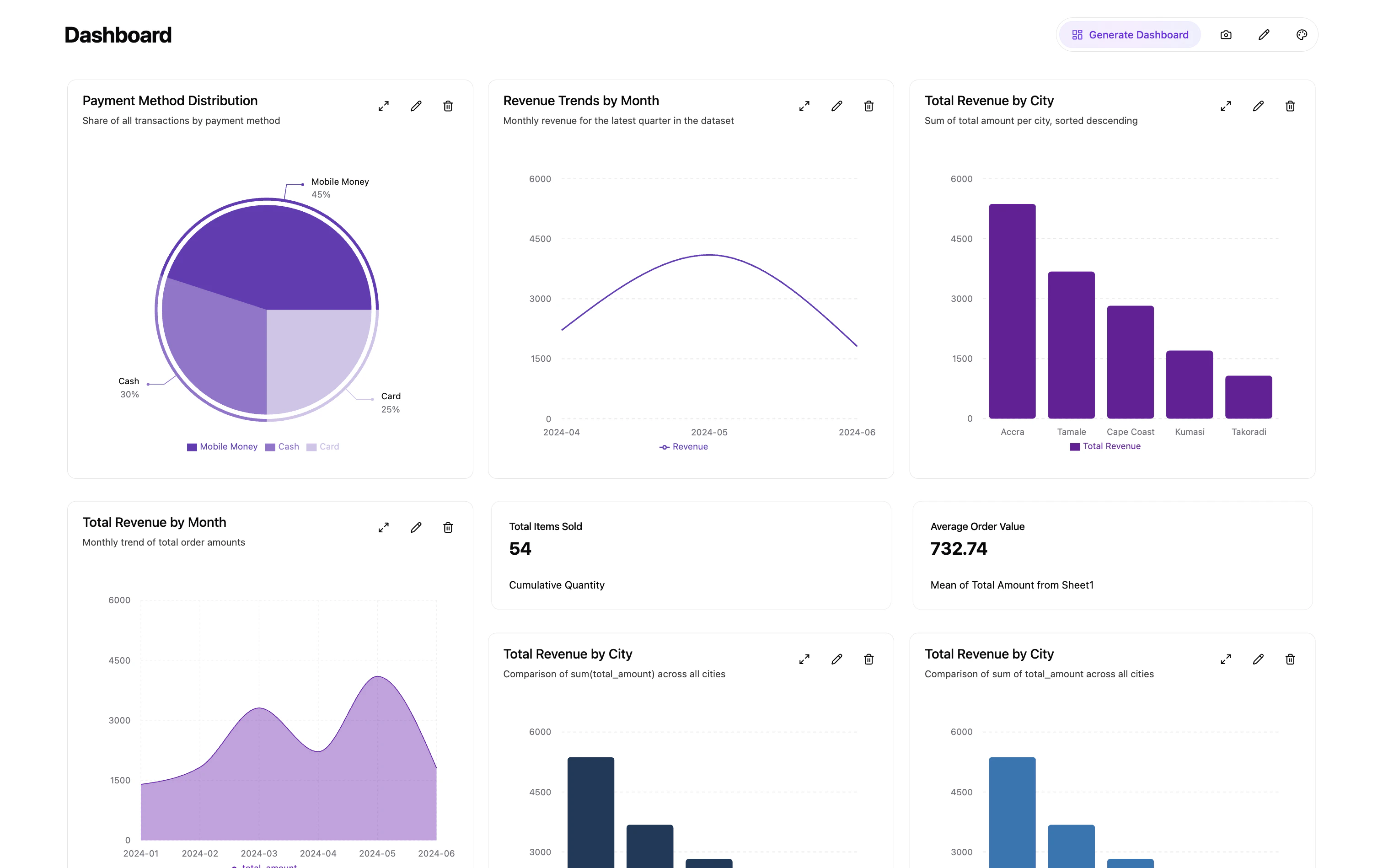
* **`PaperBoard`**: Responsive grid layout of chart cards, toolbar actions, optional chat assistant, and controlled or uncontrolled layouts.
Each top-level component handles API calls, authentication, and UI internally unless you compose lower-level exports yourself.
### `PaperChat`
Use `PaperChat` when you want the embedded AI assistant experience with chat history, chart generation, and streaming responses.
```tsx theme={null}
import { PaperChat } from '@papermap/papermap'
```
 ### `PaperCard`
Use `PaperCard` when you want to render a single chart card with Papermap toolbar actions inside your own page layout.
```tsx theme={null}
import { PaperCard } from '@papermap/papermap'
```
### `PaperCard`
Use `PaperCard` when you want to render a single chart card with Papermap toolbar actions inside your own page layout.
```tsx theme={null}
import { PaperCard } from '@papermap/papermap'
```
 ### `PaperCard` streaming variant
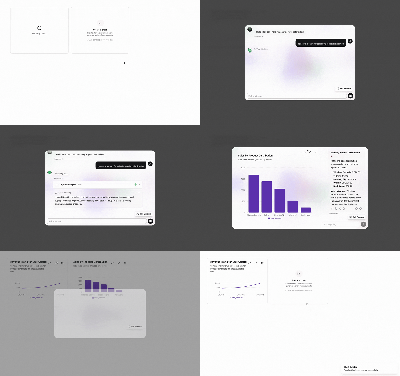
Use `variant="streaming"` when you want the chart card and the expanded conversation flow together in the same embedded surface.
```tsx theme={null}
import { PaperCard } from '@papermap/papermap'
```
### `PaperCard` streaming variant
Use `variant="streaming"` when you want the chart card and the expanded conversation flow together in the same embedded surface.
```tsx theme={null}
import { PaperCard } from '@papermap/papermap'
```
 ### `PaperBoard`
Use `PaperBoard` when you want a dashboard-style layout with multiple cards, optional chat assistant, and responsive board behavior.
```tsx theme={null}
import { PaperBoard } from '@papermap/papermap'
```
### `PaperBoard`
Use `PaperBoard` when you want a dashboard-style layout with multiple cards, optional chat assistant, and responsive board behavior.
```tsx theme={null}
import { PaperBoard } from '@papermap/papermap'
```
 ## Quick Start
### 1. Install
```bash npm theme={null}
npm install @papermap/papermap
```
```bash pnpm theme={null}
pnpm add @papermap/papermap
```
**Requirements:** React 18+ and React DOM 18+.
### 2. Import styles once
```tsx theme={null}
import '@papermap/papermap/styles.css'
```
### 3. Before you start
You will need a few Papermap values before the components can render successfully:
* **API key**: Generate this in Papermap before wiring up your app. See [Getting Your API Key](/documentation/embedding/get-api-key).
* **`workspaceId`**: Use the workspace that owns the charts and dashboards you want to embed.
* **`dashboardId`**: Use the dashboard context you want the embedded components to read from and save into. See [Basic Embedding](/documentation/embedding/basic-embedding).
* **Frontend token**: Your app should fetch a signed, base64-encoded token from your backend. See [Basic Embedding](/documentation/embedding/basic-embedding#backend%3A-generating-embed-tokens) for the backend token generation flow.
* **Optional `apiUrl`**: Only set this if your environment uses a non-default Papermap API base URL.
`token` is not the raw API key. Keep the API key and secret on your backend,
and return a short-lived signed token to your frontend instead.
### 4. Minimal integration flow
1. Create an API key in Papermap.
2. Identify the `workspaceId` and `dashboardId` you want to use.
3. Add a backend endpoint that returns a signed token to your frontend.
4. Wrap your app with `PapermapConfigProvider` or pass the values directly to each component.
5. Render `PaperChat`, `PaperCard`, or `PaperBoard`.
If you are implementing tenant-aware dashboard provisioning or server-side
dashboard creation, see [Creating
Dashboards](/documentation/multi-tenancy/creating-dashboards) and [Iframe
Embed Tokens](/documentation/multi-tenancy/iframe-tokens).
### 5. Choose an integration pattern
#### Recommended: provider at app root
`PapermapConfigProvider` is an alias for `PapermapProvider`.
```tsx theme={null}
import {
PapermapConfigProvider,
PaperChat,
PaperCard,
} from '@papermap/papermap'
function App() {
return (
)
}
```
#### Standalone components
Pass `token`, `workspaceId`, and `dashboardId` on each component when you are not using a provider.
```tsx theme={null}
import { PaperChat, PaperCard } from '@papermap/papermap'
function App() {
return (
<>
)
}
```
## Props
### `PaperChat`
| Prop | Type | Required | Default | Description |
| ------------- | ------------------- | -------- | ----------------------------- | ---------------------------------------- |
| `token` | `string` | Yes\* | -- | Base64-encoded API token |
| `workspaceId` | `string` | Yes\* | -- | Workspace ID |
| `dashboardId` | `string` | Yes\* | -- | Dashboard ID |
| `apiUrl` | `string` | No | `https://dataapi.papermap.ai` | API base URL |
| `theme` | `'light' \| 'dark'` | No | -- | Force light or dark theme |
| `placeholder` | `string` | No | `"Ask anything..."` | Input placeholder text |
| `shortcutKey` | `string` | No | `"k"` | Keyboard shortcut key |
| `autoFade` | `boolean` | No | `false` | Fade toolbar after inactivity |
| `fadeDelay` | `number` | No | `5000` | Delay before auto-fade in milliseconds |
| `className` | `string` | No | -- | Extra CSS class on the toolbar container |
\*Omit these on the component when values come from `PapermapConfigProvider` or `PapermapProvider`.
### `PaperCard`
| Prop | Type | Required | Default | Description |
| -------------- | -------------------------------------------- | -------- | ----------------------------- | ------------------------------------------------------------- |
| `token` | `string` | Yes\* | -- | Base64-encoded API token |
| `workspaceId` | `string` | Yes\* | -- | Workspace ID |
| `dashboardId` | `string` | Yes\* | -- | Dashboard ID |
| `apiUrl` | `string` | No | `https://dataapi.papermap.ai` | API base URL |
| `chartId` | `string` | No | -- | Backend chat ID to load the latest chart for |
| `chart` | `TChartResponse` | No | -- | Pre-loaded chart data that skips API fetch |
| `theme` | `'light' \| 'dark'` | No | -- | Force light or dark theme |
| `onEditClick` | `(chartId: string) => void` | No | -- | Called when the edit button is clicked |
| `onDelete` | `(chartId: string) => void` | No | -- | Called when chart deletion is confirmed |
| `onPinChange` | `(chartId: string, pinned: boolean) => void` | No | -- | Called when pin state changes |
| `wide` | `boolean` | No | `false` | Wide mode for table charts |
| `hideVariants` | `boolean` | No | `true` | Hide the chart variation selector |
| `showToolbar` | `boolean` | No | `true` | Show toolbar actions |
| `className` | `string` | No | -- | Extra CSS class on the card container |
| `variant` | `'default' \| 'streaming'` | No | `'default'` | Embedded streaming mode opens chart and conversation together |
### Pre-loaded chart example
```tsx theme={null}
import { PaperCard } from '@papermap/papermap'
import type { TChartResponse } from '@papermap/papermap'
const chart: TChartResponse = {
llm_data_chat_id: 'my-chart-id',
name: 'Revenue',
meta: { title: 'Revenue by Quarter', variant: 'default' },
pin: false,
chart_response: {
chart_type: 'bar',
data: [
{ quarter: 'Q1', revenue: 42000 },
{ quarter: 'Q2', revenue: 55000 },
],
response_type: 'chart',
schema_hints: { x_key: 'quarter', y_key: 'revenue', label_key: 'quarter' },
visualization_config: { colors: ['#3b82f6'], width: 600, height: 400 },
},
}
console.log('Edit', id)}
onDelete={(id) => console.log('Delete', id)}
/>
```
### `PaperBoard`
| Prop | Notes |
| ------------------------------------------------------------------------------------------------------------ | ------------------------------------------------------------------------ |
| `token`, `workspaceId`, `dashboardId`, `apiUrl` | Same configuration as the other components; can come from a provider |
| `charts` | Optional pre-loaded charts; otherwise fetched when `enableFetch` is true |
| `layouts` / `onLayoutsChange` | Controlled grid layouts per breakpoint |
| `isEditMode`, `editLayout`, `isViewer` | Edit and view behavior controls |
| `showToolbar`, `showScreenshot`, `showGenerateDashboard`, `showHeader`, `showChatAssistant` | Feature toggles |
| `variant` | `'default' \| 'streaming'` for embedded chart cards |
| `dashboardTheme`, `onDashboardThemeChange`, `persistWorkspaceTheme`, `renderThemeModal` | Theming controls |
| `onEditChart`, `onDeleteChart`, `onPinChange`, `onGenerateDashboard`, `onTakeScreenshot`, `onThemeModalOpen` | Lifecycle and UI callbacks |
See the TypeScript types for `PaperBoardProps` for the full API surface.
### Streaming chart card variant
With `variant="streaming"`, the edit action opens an embedded expanded view with chart, conversation, SSE streaming, save-to-dashboard actions, maximize actions, and assistant audit history.
```tsx theme={null}
import { PaperCard } from '@papermap/papermap'
export function EmbeddedStreamingChart() {
return (
)
}
```
Supported chart types: `bar`, `line`, `area`, `pie`, `radar`, `scatter`, `table`, `tile`.
## Advanced Exports
For custom layouts, the package also exports subcomponents such as `ChatAssistant`, `StreamingChartDialog`, `ChartView`, and `DataTable`, along with Zustand store helpers, hooks like `useAnalyticsStream`, API helpers such as `createApiClient`, `decodeToken`, and `buildAuthHeaders`, plus streaming and chart types.
## Troubleshooting
### Cannot find module `@papermap/papermap/styles.css`
* Use the scoped package name and the `./styles.css` export.
* Reinstall after upgrading.
### Papermap requires `token`, `workspaceId`, or `dashboardId`
* Provide the values once via `PapermapConfigProvider` or `PapermapProvider`.
* Or pass them directly on each component.
### Requests hit the wrong backend
* Set `apiUrl` on the provider or per component. The default is `https://dataapi.papermap.ai`.
### Charts do not appear in `PaperCard`
* Pass a valid backend `chartId`.
* Or provide pre-loaded `chart` data directly.
## How It Works
### Authentication
The `token` prop is base64-encoded JSON:
```json theme={null}
{
"api_key_id": "ak_...",
"workspace_id": "...",
"valid_until": 1773246356,
"signature": "88b34e..."
}
```
The library decodes the token and sends these headers on API requests:
* `X-API-Key-ID`
* `X-Workspace-ID`
* `X-Valid-Until`
* `X-Signature`
* `X-Tenant-ID: da-app`
### Chat data flow
1. The first user message may create a chat via `POST /api/v1/analytics/chats`.
2. Messages are sent to `POST /api/v1/analytics/charts/stream`.
3. SSE connects to `POST /api/v1/analytics/requests/stream` for live updates, with HTTP fallback when needed.
4. History is loaded from chat conversations, dashboard recent chats, and chart history endpoints.
### What users see in `PaperChat`
* Floating input bar with keyboard shortcut support.
* Conversation panel with streaming states, stop action, and new chat flow.
* Recent conversations, per-chat history, feedback, optional execution view, and model selection.
## Next Steps
Generate the API credentials you need before wiring up the React package.
Use iframe embedding if you want the full Papermap dashboard surface instead.
Review common integration issues and fixes.
## Quick Start
### 1. Install
```bash npm theme={null}
npm install @papermap/papermap
```
```bash pnpm theme={null}
pnpm add @papermap/papermap
```
**Requirements:** React 18+ and React DOM 18+.
### 2. Import styles once
```tsx theme={null}
import '@papermap/papermap/styles.css'
```
### 3. Before you start
You will need a few Papermap values before the components can render successfully:
* **API key**: Generate this in Papermap before wiring up your app. See [Getting Your API Key](/documentation/embedding/get-api-key).
* **`workspaceId`**: Use the workspace that owns the charts and dashboards you want to embed.
* **`dashboardId`**: Use the dashboard context you want the embedded components to read from and save into. See [Basic Embedding](/documentation/embedding/basic-embedding).
* **Frontend token**: Your app should fetch a signed, base64-encoded token from your backend. See [Basic Embedding](/documentation/embedding/basic-embedding#backend%3A-generating-embed-tokens) for the backend token generation flow.
* **Optional `apiUrl`**: Only set this if your environment uses a non-default Papermap API base URL.
`token` is not the raw API key. Keep the API key and secret on your backend,
and return a short-lived signed token to your frontend instead.
### 4. Minimal integration flow
1. Create an API key in Papermap.
2. Identify the `workspaceId` and `dashboardId` you want to use.
3. Add a backend endpoint that returns a signed token to your frontend.
4. Wrap your app with `PapermapConfigProvider` or pass the values directly to each component.
5. Render `PaperChat`, `PaperCard`, or `PaperBoard`.
If you are implementing tenant-aware dashboard provisioning or server-side
dashboard creation, see [Creating
Dashboards](/documentation/multi-tenancy/creating-dashboards) and [Iframe
Embed Tokens](/documentation/multi-tenancy/iframe-tokens).
### 5. Choose an integration pattern
#### Recommended: provider at app root
`PapermapConfigProvider` is an alias for `PapermapProvider`.
```tsx theme={null}
import {
PapermapConfigProvider,
PaperChat,
PaperCard,
} from '@papermap/papermap'
function App() {
return (
)
}
```
#### Standalone components
Pass `token`, `workspaceId`, and `dashboardId` on each component when you are not using a provider.
```tsx theme={null}
import { PaperChat, PaperCard } from '@papermap/papermap'
function App() {
return (
<>
)
}
```
## Props
### `PaperChat`
| Prop | Type | Required | Default | Description |
| ------------- | ------------------- | -------- | ----------------------------- | ---------------------------------------- |
| `token` | `string` | Yes\* | -- | Base64-encoded API token |
| `workspaceId` | `string` | Yes\* | -- | Workspace ID |
| `dashboardId` | `string` | Yes\* | -- | Dashboard ID |
| `apiUrl` | `string` | No | `https://dataapi.papermap.ai` | API base URL |
| `theme` | `'light' \| 'dark'` | No | -- | Force light or dark theme |
| `placeholder` | `string` | No | `"Ask anything..."` | Input placeholder text |
| `shortcutKey` | `string` | No | `"k"` | Keyboard shortcut key |
| `autoFade` | `boolean` | No | `false` | Fade toolbar after inactivity |
| `fadeDelay` | `number` | No | `5000` | Delay before auto-fade in milliseconds |
| `className` | `string` | No | -- | Extra CSS class on the toolbar container |
\*Omit these on the component when values come from `PapermapConfigProvider` or `PapermapProvider`.
### `PaperCard`
| Prop | Type | Required | Default | Description |
| -------------- | -------------------------------------------- | -------- | ----------------------------- | ------------------------------------------------------------- |
| `token` | `string` | Yes\* | -- | Base64-encoded API token |
| `workspaceId` | `string` | Yes\* | -- | Workspace ID |
| `dashboardId` | `string` | Yes\* | -- | Dashboard ID |
| `apiUrl` | `string` | No | `https://dataapi.papermap.ai` | API base URL |
| `chartId` | `string` | No | -- | Backend chat ID to load the latest chart for |
| `chart` | `TChartResponse` | No | -- | Pre-loaded chart data that skips API fetch |
| `theme` | `'light' \| 'dark'` | No | -- | Force light or dark theme |
| `onEditClick` | `(chartId: string) => void` | No | -- | Called when the edit button is clicked |
| `onDelete` | `(chartId: string) => void` | No | -- | Called when chart deletion is confirmed |
| `onPinChange` | `(chartId: string, pinned: boolean) => void` | No | -- | Called when pin state changes |
| `wide` | `boolean` | No | `false` | Wide mode for table charts |
| `hideVariants` | `boolean` | No | `true` | Hide the chart variation selector |
| `showToolbar` | `boolean` | No | `true` | Show toolbar actions |
| `className` | `string` | No | -- | Extra CSS class on the card container |
| `variant` | `'default' \| 'streaming'` | No | `'default'` | Embedded streaming mode opens chart and conversation together |
### Pre-loaded chart example
```tsx theme={null}
import { PaperCard } from '@papermap/papermap'
import type { TChartResponse } from '@papermap/papermap'
const chart: TChartResponse = {
llm_data_chat_id: 'my-chart-id',
name: 'Revenue',
meta: { title: 'Revenue by Quarter', variant: 'default' },
pin: false,
chart_response: {
chart_type: 'bar',
data: [
{ quarter: 'Q1', revenue: 42000 },
{ quarter: 'Q2', revenue: 55000 },
],
response_type: 'chart',
schema_hints: { x_key: 'quarter', y_key: 'revenue', label_key: 'quarter' },
visualization_config: { colors: ['#3b82f6'], width: 600, height: 400 },
},
}
console.log('Edit', id)}
onDelete={(id) => console.log('Delete', id)}
/>
```
### `PaperBoard`
| Prop | Notes |
| ------------------------------------------------------------------------------------------------------------ | ------------------------------------------------------------------------ |
| `token`, `workspaceId`, `dashboardId`, `apiUrl` | Same configuration as the other components; can come from a provider |
| `charts` | Optional pre-loaded charts; otherwise fetched when `enableFetch` is true |
| `layouts` / `onLayoutsChange` | Controlled grid layouts per breakpoint |
| `isEditMode`, `editLayout`, `isViewer` | Edit and view behavior controls |
| `showToolbar`, `showScreenshot`, `showGenerateDashboard`, `showHeader`, `showChatAssistant` | Feature toggles |
| `variant` | `'default' \| 'streaming'` for embedded chart cards |
| `dashboardTheme`, `onDashboardThemeChange`, `persistWorkspaceTheme`, `renderThemeModal` | Theming controls |
| `onEditChart`, `onDeleteChart`, `onPinChange`, `onGenerateDashboard`, `onTakeScreenshot`, `onThemeModalOpen` | Lifecycle and UI callbacks |
See the TypeScript types for `PaperBoardProps` for the full API surface.
### Streaming chart card variant
With `variant="streaming"`, the edit action opens an embedded expanded view with chart, conversation, SSE streaming, save-to-dashboard actions, maximize actions, and assistant audit history.
```tsx theme={null}
import { PaperCard } from '@papermap/papermap'
export function EmbeddedStreamingChart() {
return (
)
}
```
Supported chart types: `bar`, `line`, `area`, `pie`, `radar`, `scatter`, `table`, `tile`.
## Advanced Exports
For custom layouts, the package also exports subcomponents such as `ChatAssistant`, `StreamingChartDialog`, `ChartView`, and `DataTable`, along with Zustand store helpers, hooks like `useAnalyticsStream`, API helpers such as `createApiClient`, `decodeToken`, and `buildAuthHeaders`, plus streaming and chart types.
## Troubleshooting
### Cannot find module `@papermap/papermap/styles.css`
* Use the scoped package name and the `./styles.css` export.
* Reinstall after upgrading.
### Papermap requires `token`, `workspaceId`, or `dashboardId`
* Provide the values once via `PapermapConfigProvider` or `PapermapProvider`.
* Or pass them directly on each component.
### Requests hit the wrong backend
* Set `apiUrl` on the provider or per component. The default is `https://dataapi.papermap.ai`.
### Charts do not appear in `PaperCard`
* Pass a valid backend `chartId`.
* Or provide pre-loaded `chart` data directly.
## How It Works
### Authentication
The `token` prop is base64-encoded JSON:
```json theme={null}
{
"api_key_id": "ak_...",
"workspace_id": "...",
"valid_until": 1773246356,
"signature": "88b34e..."
}
```
The library decodes the token and sends these headers on API requests:
* `X-API-Key-ID`
* `X-Workspace-ID`
* `X-Valid-Until`
* `X-Signature`
* `X-Tenant-ID: da-app`
### Chat data flow
1. The first user message may create a chat via `POST /api/v1/analytics/chats`.
2. Messages are sent to `POST /api/v1/analytics/charts/stream`.
3. SSE connects to `POST /api/v1/analytics/requests/stream` for live updates, with HTTP fallback when needed.
4. History is loaded from chat conversations, dashboard recent chats, and chart history endpoints.
### What users see in `PaperChat`
* Floating input bar with keyboard shortcut support.
* Conversation panel with streaming states, stop action, and new chat flow.
* Recent conversations, per-chat history, feedback, optional execution view, and model selection.
## Next Steps
Generate the API credentials you need before wiring up the React package.
Use iframe embedding if you want the full Papermap dashboard surface instead.
Review common integration issues and fixes.